Three key functions of ISA
The ISA has 3 key functions. It is informative, directional and locational.
Informative
People with disabilities visiting a building need to know whether accessible facilities have been provided. They can immediately see that accessible facilities are available inside.
An individual's independence is enhanced by not having to ask whether a building is accessible.
When the ISA is displayed on a place of assembly, people expect that suitable wheelchair spaces are provided as well as parking (if any), toilets, an accessible ticket counter, and an assistive hearing device. Inside the building, directional and locational signage should identify the location of these amenities.
For accommodation facilities, the ISA is most useful on a street billboard, in promotional material or on the door or window of the reception. The ISA should not be displayed on the door of the accessible room or unit.

[Fig 5]
A noticeboard should include information on if, or where, accessible facilities are available.

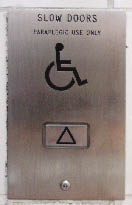
Fig 6 ISA on lift sign
Sometimes in a series of lifts, one will have the ISA. This indicates that this lift will stay open longer than the required 5 seconds. However, 'Paraplegic use only' is inappropriate. The ISA covers everyone with restricted mobility.
Directional
It is reassuring to know an accessible amenity is provided, but finding it can be difficult unless there is directional signage. For example, an arrow showing the location of a ramp is simple, but valuable.

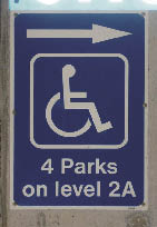
Fig 7 ISA ramp sign
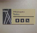
Similar signs can be used for locating accessible toilets and car parks (see below and opposite). An example is also given in Figure 5 of F8/AS1 in the Acceptable Solution for Building Code Clause F8 Signs.

Fig 8 ISA toilet sign

Fig 9 ISA parking sign

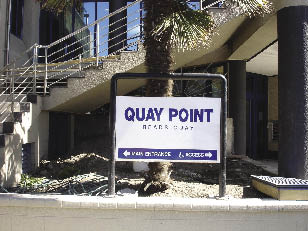
Fig 10 ISA on signage
Billboards, whether internal or external, should have directional information for guiding those with restricted mobility. Not everyone can climb stairs or use an escalator.
Locational
It is essential to use the ISA to identify car parks and toilets. The ISA is usually sufficient by itself, but if wording is required it should be kept short. A sign should use the word 'accessible', not the word 'disabled', which is inappropriate when used in this way.

Fig 11 ISA toilet sign (2)
Above is an excellent example of how the ISA should be displayed. Words are not required. These signs are understood internationally.
Fig 12 ISA overkill
An example of excessive information. The word 'disabled' is unnecessary as the toilet is not disabled, but is compliant with the Building Code.
Fig 13 ISA parking sign (2)
A typical parking sign makes it clear that the park is only for people with disabilities.
Fig 14 ISA shower change room
Clear colour contrast makes identification easier for all users.